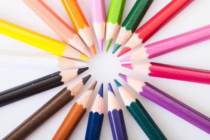
Color plays a huge role when it comes to peoples’ perceptions of your brand and purchases. It helps to convey a message or meaning without words.
Did you know that people see color before they see anything else? Shapes and symbols are seen next, followed by words. Color increases brand recognition by up to 80 percent (Source: University of Loyola, Maryland study).
When I think of brown, I think of UPS; red – Coca Cola; blue – DBP Marketing Solutions. Kidding, but you get the idea!
What’s interesting is that the purchasing habits based on color are due to the customer’s perception that, for example, the color red is known to mean “danger” and if they buy that red can of Raid, it will mean danger for the pesky bugs at home.
Author Gregory Ciotti, writer of “The Psychology of Color in Marketing and Branding”, mentions that color psychology isn’t backed by too much data because, “elements such as personal preference, experiences, upbringing, cultural differences, context, etc., often muddy the effect individual colors have on us.”
So what do you do when it’s time to pick the color for your logo website?
Researchers have shown that predicting the customer’s reaction to how appropriate the color is for your brand or product is key. Let’s say your brand is targeted to girls ages 8 – 16. You are more than likely not going to want a logo or packaging that is black and dark in color, right? Maybe you’d go with more of a bright color, sparkles, hearts – colors more attractive to that demographic.
So when you are ready to pick the color for your new business’s logo or product, take into consideration your target market’s demographics.